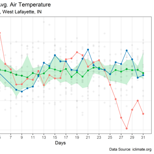
In the previous post, we looked at daily temperatures during November 2018 at the ACRE weather station in West Lafayette, IN. We then compared it to daily temperatures from the past. In the same post, a plot of annual average temperature in the climate division where the ACRE weather station is located was presented. Mann-Kendal trend analysis suggested that there was a significant increasing trend in average yearly temperature over the selected climate division. All the analysis was done in R programming language. The R-code and data were published on GitHub with the intent of supporting open science, promoting reproducible research, and potential future collaborations. In this post, I present an interactive visualization of the average monthly temperatures over Climate Division 4 in Indiana. The drop-down provided below the plot allows users to select the month for which temperatures have to be visualized. The top three warmest years for the selected month are shown as red-hued markers, and similarly, three coldest years are denoted using blue-hued markers. Users can click on individual markers to query the exact temperature and the corresponding year. I have not computed any statistics, or trend at this point, and these visualizations would be presented in the near future and presented as a separate post.
The code for this post is available on Github, so do check it out!
If you use the material/media/images provided in this post for your school, academic work, news media, or social media, I encourage you to cite this post as follows:
Mallya, Ganeshchandra. “Visualizing Monthly Temperatures.” Towards Open Science, 12/17/2018, https://gmallya.com/visualizing-monthly-temperatures/.
Monthly Avg. Temperature – Climate Division 4, Indiana


