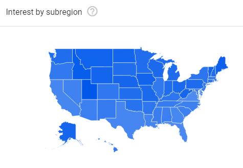
I was working on a water quality project over the past few days, and the results I obtained were quite interesting. One thing led to another, and I ended up exploring Google Trends in an effort to identify real-world events that may have been a factor for those exciting results that I was seeing. After going over the data and plots available on Google Trends, I realized that the actual data and visualization I was looking for was not directly available. Basically, I wanted a choropleth map showing the most popular search queries in each state that were relevant for my study over a certain period. Instead, what was available was a choropleth map showing the popularity of one search query term across different states in the USA, as shown below.
Therefore, I spent the last several hours downloading, analyzing, and visualizing the data in the form most relevant to my use-case.
As I was about to wrap up my work, my dear wife stopped by and casually asked what cookies are most popular during this time of the year (Christmas/New Year)? All I had to do to answer her query was run a script with the relevant search term to download most popular queries by each state, quickly clean up the downloaded data, and visualize it in the browser. Since I had everything ready, I was able to share my findings with her in less than 5 minutes.
I am sharing that visualization with all you. From the plot below, it is quite evident that chocolate cookies are popular in 29 out of 50 states and D.C., followed by chocolate chip cookies. The study did not account for seasonal changes in popularity, but rather is an overall popularity measure over the period 2004 to 2018. In terms of coding efforts, most of the heavy lifting was done in Python, and the results were visualized using D3. The code with appropriate license will be pushed to Github, once I get to cleanup and add relevant comments to the code.
The code for this post is available on Github, so do check it out!
If you use the material/media/images provided in this post for your school, academic work, news media, or social media, I encourage you to cite this post as follows:
Mallya, Ganeshchandra. “Visualizing Google Trends Data.” Towards Open Science, 12/21/2018, https://gmallya.com/visualizing-google-trends-data/.
Top queries for cookies by state (from Google Trends)
This is purely a data visualization exercise, I am not trying to make a statement for/against any cookies. The visualization is far from perfect, and I hope to improve this in the future. The query data comes from solely Google Trends and was queried on 12/20/2018. Popular search queries are displayed when the user clicks on any state. When available, top queries according to Google Trends from 2004 – present were considered in this study. Search queries that I thought were not directly related to the search term cookies were filtered out. For example, a queries such as cookie recipes, chocolate, etc., were excluded. The numbers alongside the queries indicate its popularity and range from 100 to 0. For example, the most popular search query gets a score of 100. Similarly, a query which is half as popular gets a score of 50, and so on.